Key principle
For spot-color transfers, the color name should be easy for the user, but behind it there must be a clear production reference. For Unipatch, that reference is primarily Pantone.
The Unipatch portal has been designed to make the Unisport team's daily work as simple as possible while keeping the production process technically safe and controlled. These two goals sometimes require a compromise: a user may want to enter simply "Red", "Blue", "Navy" or "Black", while production needs a precisely defined color that can be prepared in exactly the same way today, next month and on every repeat order.
This article explains why Pantone references are used in the portal, why the issue with the color Black occurred, and how we can work together to build a simple list of Unisport "standard colors" without losing control over production quality and repeatability.
RGB
screen and light
CMYK
process printing
PANTONE
spot color / recipe
1. The same "color" means different things in different environments
There is no single universal system for describing color. The way we define it depends on where the color is created: on a screen, in process printing, or as a separately mixed spot-color ink.
RGB
An additive light model used mainly by monitors and digital devices. The image is built from Red, Green and Blue channels. The same RGB values can look different on different screens, so RGB is not a sufficient reference for mixing a spot-color ink.
PANTONE
CMYK
A process-printing model based on Cyan, Magenta, Yellow and Black. It is the natural environment for many digital and offset printing processes, including the full-color part of digital and hybrid transfers.
A reference system for spot colors. In our process, a specific Pantone number is linked to an ink recipe and provides an unambiguous reference point for production and quality control.
A simple analogy
Just as manufacturers of paints and coatings often use the RAL system, our spot-color production needs a specific Pantone reference. The word "Red" alone still does not tell us exactly which red we should produce.
2. Why is Pantone so important for spot-color transfers?
A spot-color transfer is built layer by layer. Each visible color is a separate ink that we prepare and print in a controlled way. This is why a Pantone number is not simply a color name in the portal - it is part of the production specification.
- allows us to assign and retain a specific ink recipe;
- ensures color repeatability when the same logo is ordered again;
- supports quality control and clear communication between sales, prepress and production;
- removes the ambiguity of names such as Red, Navy or Blue, which may mean different shades to different people.
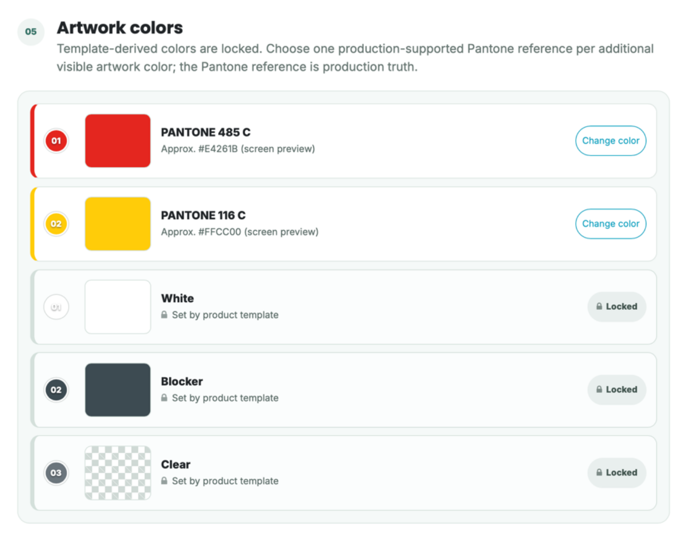
Portal example: the specific Pantone reference is the production reference; the HEX code and the on-screen swatch are only a preview.
Important: the screen is only a preview
The color shown on a monitor is a digital representation and may vary depending on the device, display profile and settings. For this reason, production does not treat the on-screen swatch or HEX value as the primary reference - the approved Pantone / production standard is the reference that matters.
3. Why was there no simple "Black" color before?
This question came up when creating a new version of the Unisport logo. An existing product showed the color "Black", while the color search displayed several different black variants when a new logo was being created.
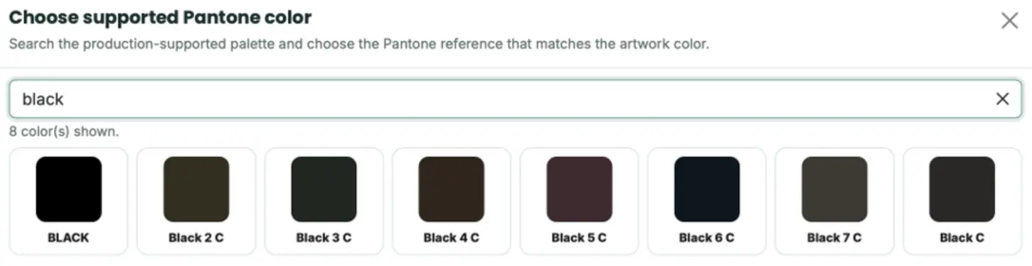
After entering "black" in the library, you can now see both the BLACK color added by us and the different Pantone Black references.
The reason is simple: the portal's base color library was built from the Pantone palette imported into our system. That palette contains several black variants - for example Black C, Black 2 C, Black 3 C and so on - but it did not contain a separate simplified entry named only "Black".
Older products that we created directly from the administrative side could use more simplified names. The backend gives us greater editing flexibility than the user interface. We intentionally do not expose every technical function in the portal because we want to keep the data consistent, reduce the risk of accidental changes, and give users only the functions they need in their daily work.
What did we change after this question?
We added an additional BLACK entry to the library. Its recipe is intentionally very simple: 100% ready-made black ink, with no additions of any other colors. This means the user can simply search for "black", while production receives a clearly defined and repeatable recipe.
This is a good example of how the portal evolves
If a simple name or alias
can save the user time without weakening technical control, we want to
introduce that improvement. The portal should evolve together with the needs of
the Unisport team.
4. Gold and Silver - the same principle
In the same way, we added easy-to-find Gold and Silver entries. In these cases, the user-friendly name is directly linked to a specific Pantone reference, so ease of use does not conflict with production requirements.

GOLD 871 C and SILVER 877 C - user-friendly search names linked to specific production references.
5. How do we want to handle Unisport “standard colors”?
We understand that in everyday sales work it is much more convenient to use names such as Blue, Red, Navy, Green or Black than to remember Pantone numbers. We do not want to make this difficult. However, we need to keep one rule: every user-friendly name must lead to a specific, approved production reference.
Proposed model
Unisport provides a list of the standard color names used by the team. Together, we assign a specific Pantone to each name. We then add a user-friendly alias to the library that points to the same production recipe.
1. The Unisport team prepares a list of the names used most often, for example Red, Blue, Navy, Green, Royal Blue, etc.
2. For each item, we agree on a specific Pantone reference. If the color is already known, we use it directly. If it needs to be matched, we can help evaluate and select the most appropriate reference.
3. In the portal, we can add a user-friendly name such as "RED" linked to the agreed Pantone color. The original Pantone entry can remain in the library at the same time.
4. Both names point to the same production recipe, so easier searching does not change the technology or the repeatability of the color.
Example: if we jointly agree that Unisport's standard "Red" corresponds to Pantone 485 C, the library can contain a user-friendly "RED" entry, while from the production side it will still be exactly Pantone 485 C and the same recipe. This is only an example of the mechanism - the actual color assignments should be confirmed together.
Why do we not create an arbitrary "Red" without a reference?
Because the name alone is not a sufficient specification. Two different clubs may understand completely different shades by the word "Navy". If a color were stored without a clear reference, we could not be certain which exact shade should be reproduced on a repeat order. This is where technical discipline protects the user: once a reference has been agreed, we can return to the same recipe and the same quality standard every time.
6. What about colors that have been used historically?
If Unisport has a standard color that has been used for years but does not have its Pantone number, the process does not have to stop. We can help organize and define it. If needed, a supplied sample or a previously produced transfer can be compared in our color laboratory and an appropriate Pantone reference can be proposed. Once agreed, the color can be added to the recipe library and reproduced in a controlled way in future production.
The goal is not bureaucracy
We do not want to shift printing know-how onto the user. We simply want every color decision to be captured in a clear, repeatable standard before the product enters regular production.
7. How to request new colors and suggest portal improvements
The Unipatch portal is being implemented and developed together with the Unisport team. If a color, user-friendly name, category or other feature is missing and would make everyday work easier, we want to know about it.
Support channel
support@unipatch.shop
Please use this address for color-related questions, requests to add new library entries, portal suggestions, and other technical questions concerning the product or application.
What would we like you to prepare now?
The most practical next step is for the Unisport team to prepare a short list of the color names you use as standard terms in everyday work - for example Black, Red, Navy, Blue, Royal Blue, Green, etc. Based on that list, we can organize the Pantone mapping together and build a library that is both intuitive for sales users and safe for production.
Summary
RGB - primarily describes color on a screen;
CMYK - is the basis of process printing;
Pantone - is our key reference when mixing and reproducing spot colors;
user-friendly names - such as Black, Gold, Silver, Red or Navy can simplify searching, but they must be linked to a clear production reference;
portal - must remain technically safe while also developing in line with the real needs of Unisport users.
We are on the same side of the process: Unisport should be able to specify what it needs quickly and intuitively, while Unipatch turns that specification into a repeatable, controlled product. Whenever we can simplify the interface without compromising technical quality, we want to do so.